IRS Website Redesign Delayed as Efficiency Department Tackles User Experience Issues

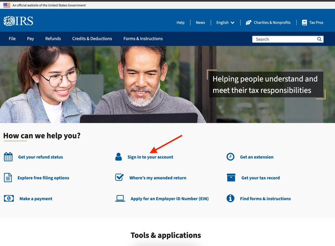
On the http://IRS.gov website, the “log in” button was not in the top right on the navbar like it is on most websites. It was weirdly placed in the middle of the page below the fold.
An IRS engineer explained that the *soonest* this change could get deployed is July
In a recent revelation, a user highlighted a curious design quirk on the IRS website, where the “log in” button was awkwardly located in the middle of the page, rather than the conventional top right corner. This unconventional placement has sparked discussions among taxpayers and web design enthusiasts alike, raising questions about user experience on a site that handles sensitive financial information.
In response to the feedback, an IRS engineer indicated that changes to the website’s layout are in the pipeline, with the earliest potential deployment slated for July. This announcement has led to speculation about how the IRS plans to enhance its digital platform, aiming to improve usability for millions of Americans navigating tax-related services online. As the agency prepares for these updates, many will be watching closely to see how the changes unfold and whether they will streamline the often complicated process of filing taxes.
This tweet is brought to you from:
https://x.com/doge